
Charting of prices for trading seems to have been formally developed in the early 1700´s by the Japanese businessman – Munehisa Homma – as a methodology to track and analyse the price of Rice Contracts. This methodology is what has become known as Candlestick charting.
This methodology came, very quickly, to be used by all the major rice traders and merchants.
A candlestick shows the Open, High, Low & Closing prices for what ever time period is being referred to. The Open and Close are connected by a wide band called the ¨Body¨ of the candle while the high and low are represented by a very thin line from the body to the extremity of the high or low – these are called ¨wicks¨ (in reference to candles) or ¨Tails¨.
Typically of the Japanese, everything is required to have a descriptive name and therefore every form of a candle imaginable has its own individual name, some of them are very interesting, such as – Hanging Man – Morning Star – Spinning Top, and the list goes on.
Candlestick Charts remained hidden from the west until late in the 20th Century, with 1 of the most widely read books on the subject being written by Steve Nison – Japanese Candlestick Charting techniques – which was published in 1991.
History of Bar Charts
Bar Charts for trading were developed in the Western Countries and promoted very heavily by Charles Dow early in the 20th Century.
Bar charts depict the same information as Candle charts and each bar depicts the Open, High, Low & Close, and Traders being simple folk, called them Open, High, Low, Close Bar charts or OHLC Bars for short.
Bars are merely graphed differently than candles, they have a relatively thick vertical line from the high to the low, a small horizontal tick on the left side denoting the open and a small tick on the right denoting the close.
Why I prefer Bar Charts
Bar Charts can be visually easier to read than Candles merely because of the construction and visually display the high and low more clearly than candle charts, as such can be much more effective when the high and low are an important part of the construction of a formation, such as Flags & Triangles.
Bar charts also assist in more accurate placement of Trend Lines which by itself can assist in higher probabilities of success.
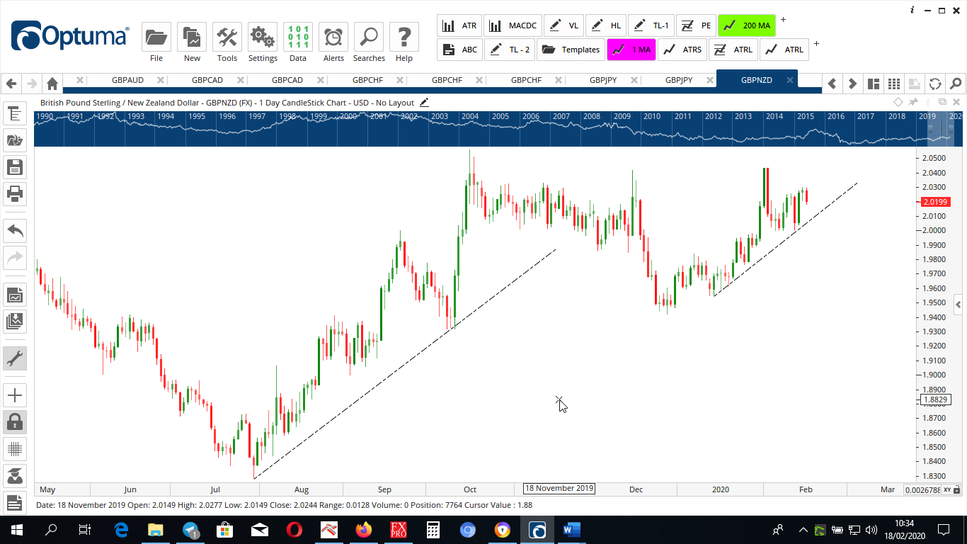
This is a Candlestick Chart
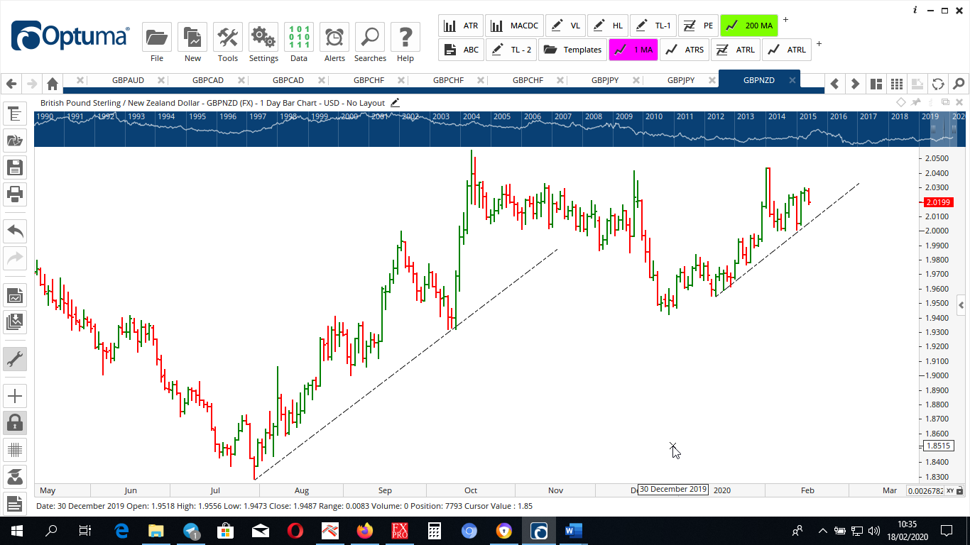
This is the same chart using Bars
Personally I find bar charts less cluttered and because the highs and lows tend to be more readily identified on bars than candles, you get more accurate line placement and this accuracy is vital for line placement on Trading Patterns.
Now I see why you trade using bars grooy man.
Yep, I find them cleaner than Candles which date back to the 17th Century